

Happy New Year! Office Hours (30-minute, one-on-one mini-consults with yours truly, are open for January! Paid subscribers get 20% off using the code in the subscriber-only chat).
When I left my job to do “this” (I’m gesturing around the room and towards my laptop), I wasn’t sure what to call myself. “Interior designer” is too limiting (not to mention I have no licensure or certification), “art and design consultant” is a mouthful and is kind of giving Anna Delvey. No part of me considered “therapist”, but you’d be shocked: many of my calls begin with a vent session or rocky backstory— a recently-divorced mom who wants her new place to feel like a reclamation, a science whiz uprooting their life for a residency and craving home. Many people who, in so many ways, just don’t know what they want. Let me be clear: I love this part, and if you want to spend an Office Hours session role-playing a run-in with your ex, I’m down.
But they come to me for a reason: their place isn’t hitting. I’ve considered making a bible of sorts with my most-uttered advice: no, your wood doesn’t need to match, no, I don’t recommend No**** K****, yes, I’ll tell you where to buy vintage rugs instead, and have you considered putting a small piece over each nightstand instead of torturing yourself trying to find one big one for over the headboard? There is one concept, however, that is so often relevant, but difficult to cover in a single session: visual weight.
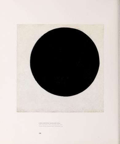
I learned about visual weight outside of an interior design context, during my freshman year of art school. The assignment was to convey different emotions by drawing a single circle in a 4”x4” square. The circle could be big or small, merely outlined or totally opaque, but it could only be one grayscale circle. To convey “happiness”, many students drew a pert, bright circle floating towards the top of the frame. “Loneliness” was often conveyed by a bloated, darker circle cowering in a lower corner. “Peace” was always dead center.
Even with our underdeveloped design vernacular, we freshman already displayed an innate sense of visual weight. Visual weight has nothing to do with the actual weight of an object (it was, after all, a two-dimensional circle), but rather where the object attracts the eye, and if that attraction drags the object down or makes it appear more buoyant. For example, we all seemed to grasp how a darker circle would naturally drift to the bottom of the frame, whereas the “happiness” circle’s lighter tone helped it to float to the top of the frame without tension. If you’re rolling your eyes at the word “tension”, consider Michael Heizer’s 2012 piece “Levitated Mass”, housed at Los Angeles County Museum of Art:
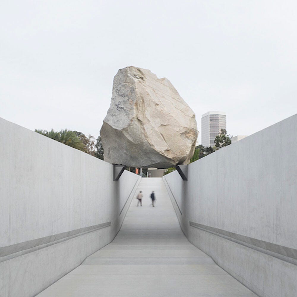
The rock’s scale and materiality show immense visual weight, while the skimpy brackets and the air underneath the rock show little to none. This creates a dissonance that holds the entirety of the piece’s visual interest: it’s not like there’s brushstrokes or smiling faces to focus on here. It’s a rock.
This dissonance is the same reason now-ubiquitous Noguchi pendants hold your attention: the scale implies much visual weight, but the illusion of floating in midair acts as a foil. There is a rule-of-thumb in the design world that pieces with more visual weight like to be countered by pieces with less visual weight. I think of the heavy pieces as the view, and the light pieces as the glint of a lens flare— it makes for a more dynamic image. Things to consider when deducing a piece’s visual weight:
Scale (larger = heavier)
Hue (darker = heavier)
Texture (more complex = heavier)
Positioning (lower = heavier)
Shape and form (simple, bold shapes hold more weight; spindly forms allow more “air” to pass through)
Too many visually light pieces will make a space feel unmoored and fragile. Picture those peppy “happiness” circles we were drawing in art school: too many of them and it stops feeling happy, and starts getting manic. Below: leggy, small footprint accent chairs paired with a lucite, transparent coffee table, a spindly light fixture, and bright colors everywhere:
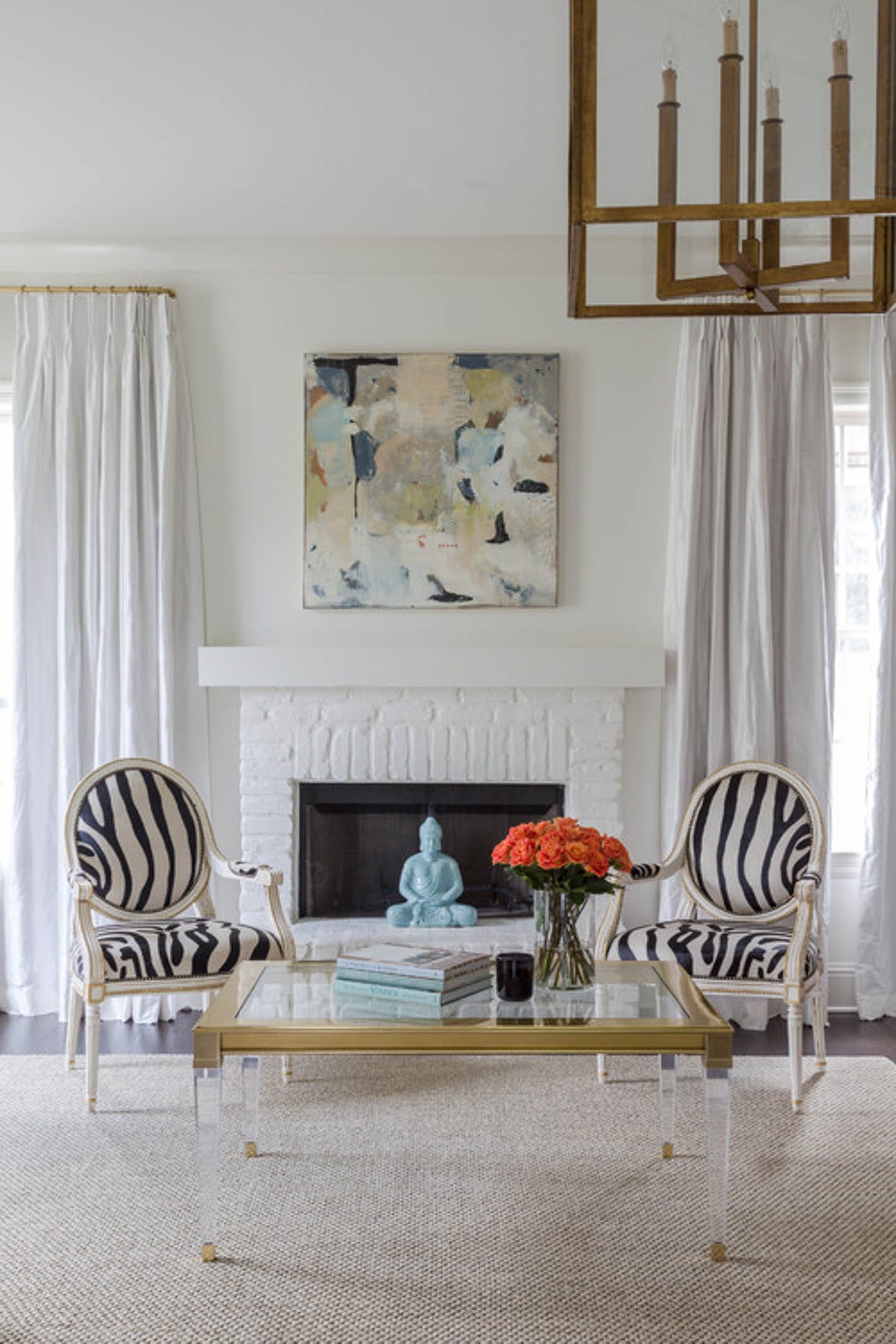
Doesn’t it look like I could huff, puff, and blow this place down?
On the other hand, too many heavy pieces in a room feel like the slovenly, sunken ‘alone’ circle from freshman year— unchecked heaviness reads cluttered and drab:
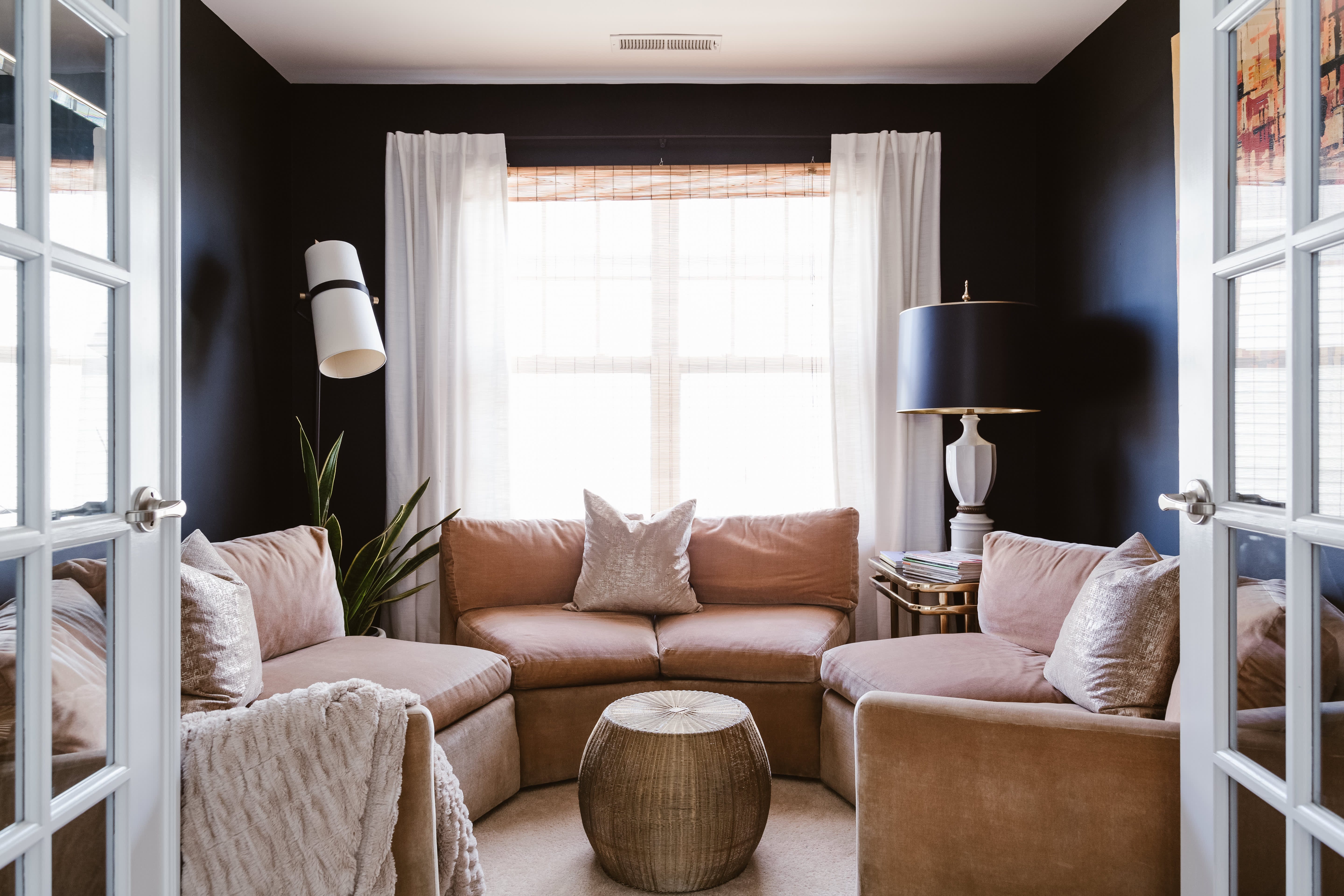
There’s no air underneath the sofa nor the coffee table, the complex texture of the throw blanket only adds to the visual weight, and the dark walls aren’t helping. I’m suffocating in here!
So, back to your apartment: say you just bought a couch. Before you pull the trigger on the accent chairs, let’s consider the visual weight of the couch. Is it leggy, or more grounded? Another way of asking this: how much air lives underneath it?
A low, skirted sofa is doing a lot of visual work. Pair it with two tufted club chairs and a dark wood coffee table, and suddenly the room is pinned to the floor. On the other hand, pair the fatty sofa with leggy accent chairs and a light that lifts the eye upward, and we have a conversation:
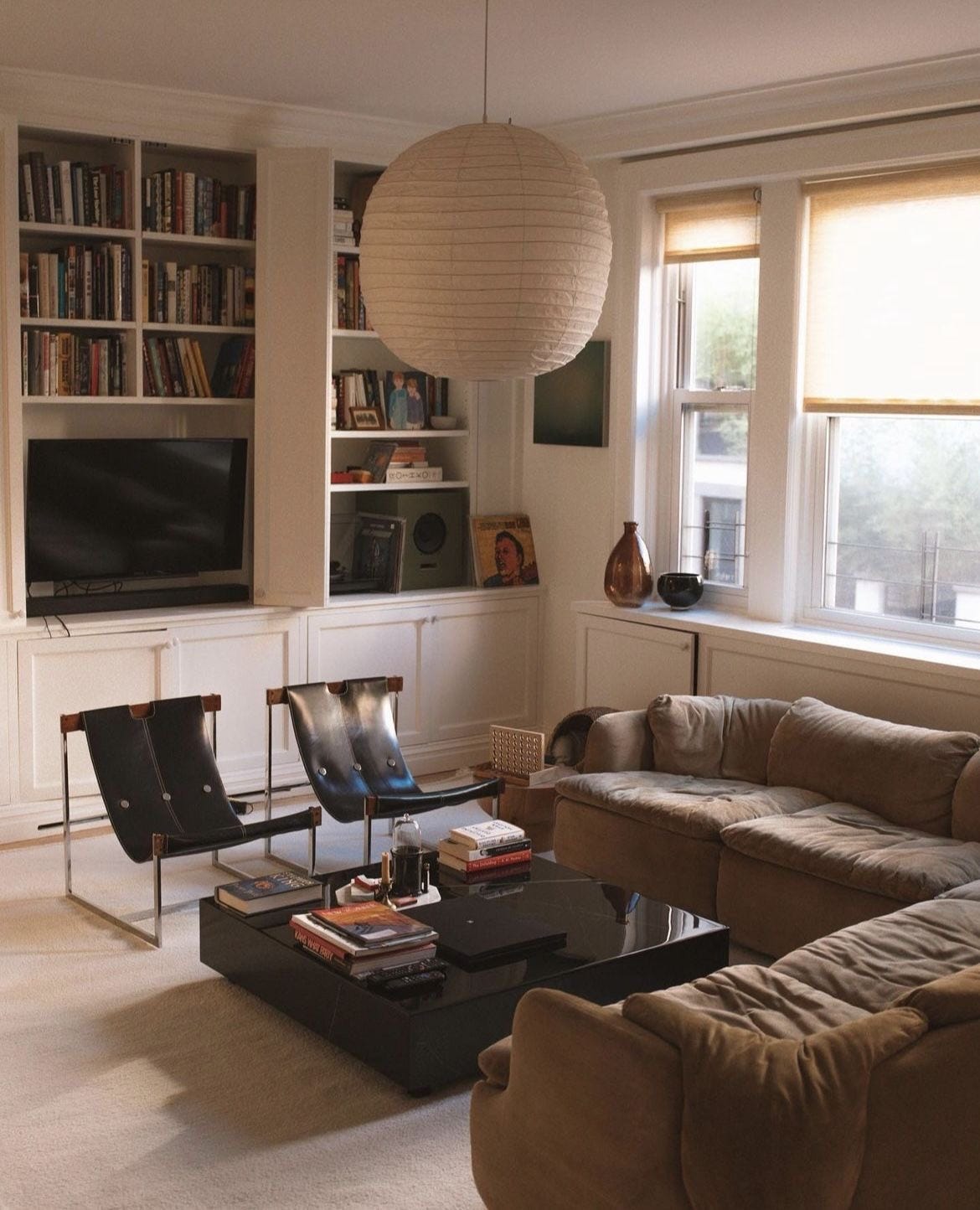
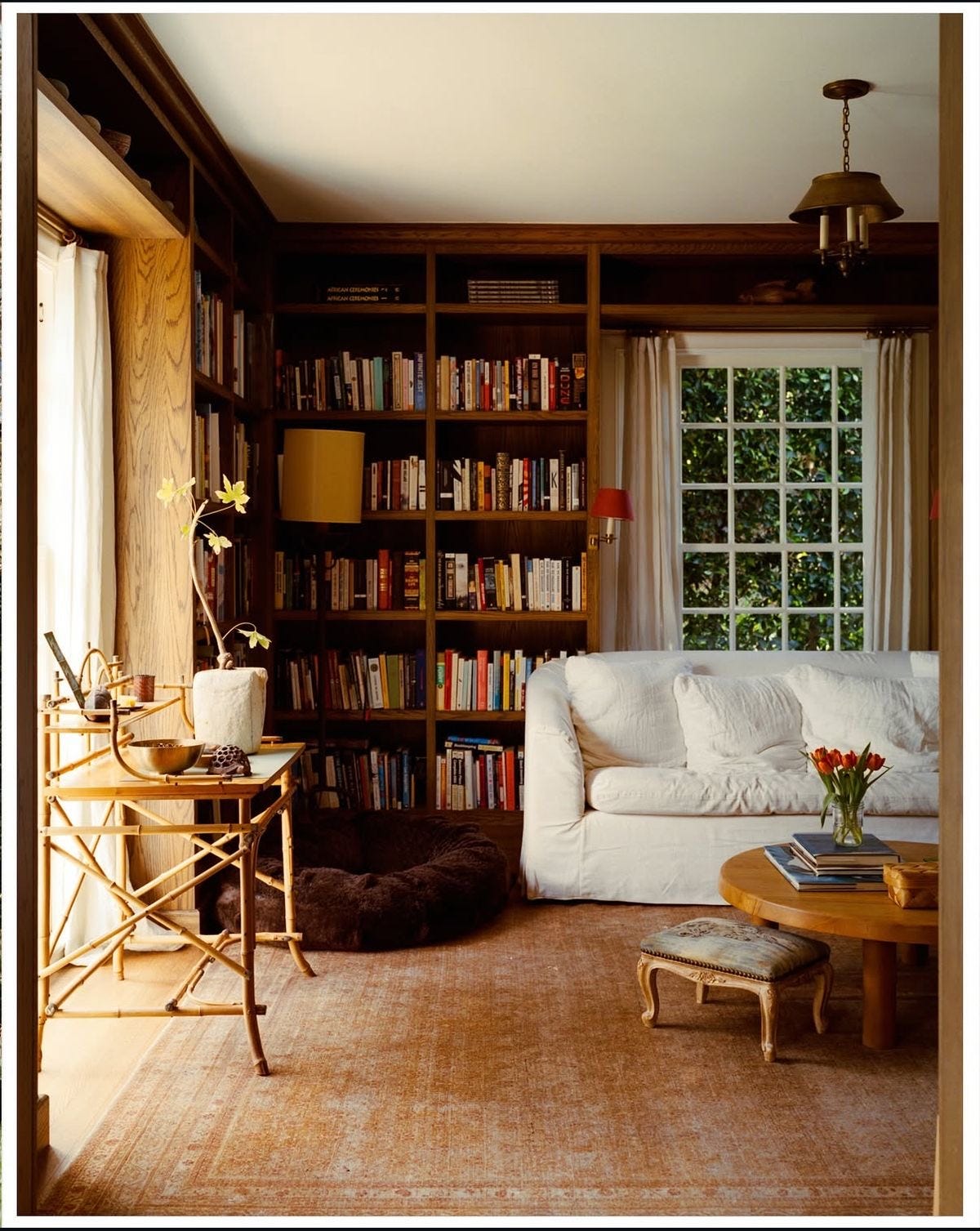
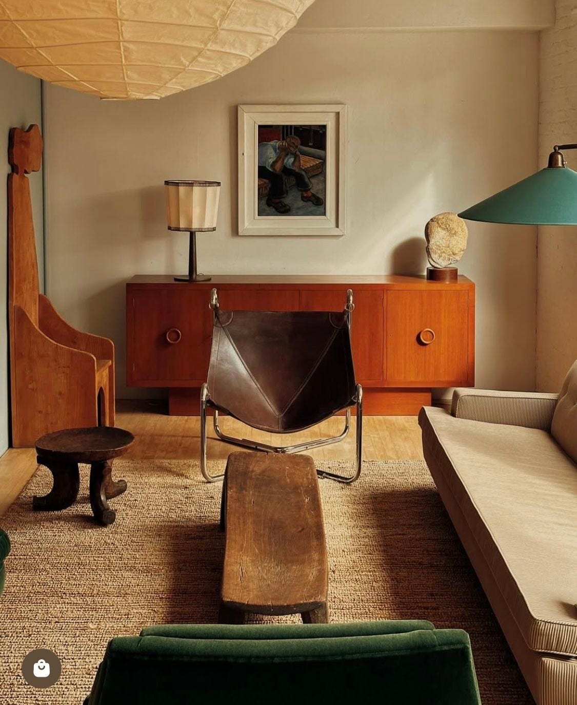
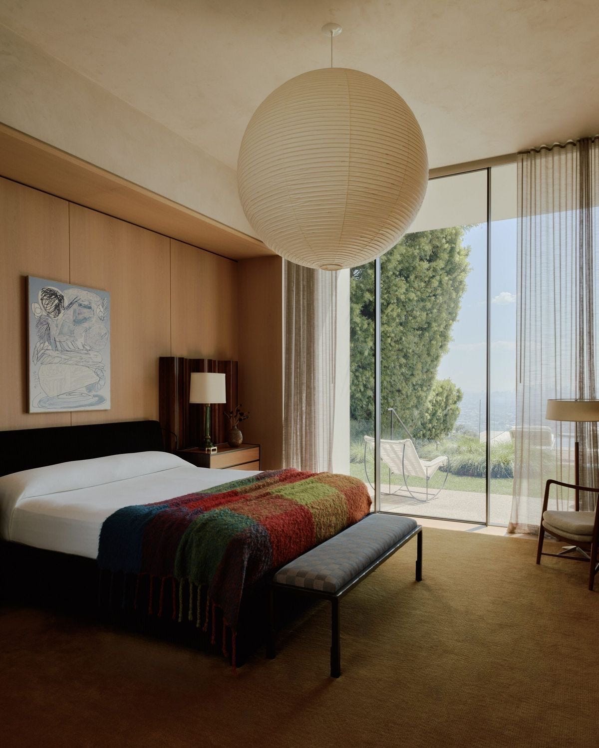
The visual weight equation is the main reason I think a bench at the foot of the bed always hits. A bed’s inherent scale, topped with densely-packed pillows and duvets, reads heavy. A leggy bench, on the other hand, is the perfect counter:
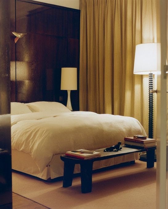
It’s not about balance. Balance is boring: symmetrical, predictable, and motionless. The goal with visual weight isn’t an equal-and-opposite reaction, but to harness the tension between.
A single shape on a page, a leather chair, or a pendant light: each carries a weight and an energy. Your job is to channel it.
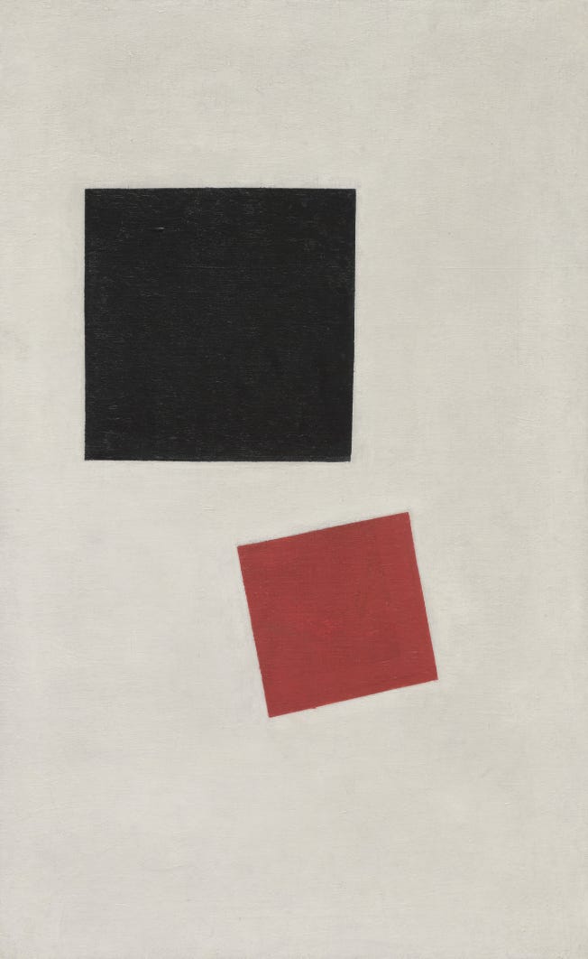
Hoping everyone feels like the pert circle at the top of the square today
I do interior 3D visualization for a large real estate developer in Denmark. The tips in this post alone has massively improved my interiors. Subscribed <3